Context
This introduction to clustering data was led by Prof.Gilles Durrieu, UBS during the second semester of the uni. year 2021-2022. The course is “Introduction to Data Mining”. Because the course is in french the contents of the column names are in french as well.
We have at our disposal two small datasets : temperature and fromage (cheese in english). We’ll start off with the temperature dataset.
Temperature
This dataset the temperature levels of 32 French cities (32 tuples in total). We have the monthly temperature over 10 consecutive years. For a given month and a given year we have the average daily temperature in a particular city. Then for each month, the average temperature was calculated.
Setting up our data for clustering
1
2
3
4
5
6
7
#Loading our data

data = read.table('D:/2021-2022-UBS/Statistique/Data mining/Temperature_France.txt', sep="\t", header=T)

#Displaying the head

head(data)
1
2
3
4
5
6
7
8
9
10
11
12
13
14
##   ville janvier fevrier mars avril  mai juin juillet aout septembre octobre
## 1 ajac      7.7     8.7 10.5  12.6 15.9 19.8    22.0 22.2      20.3    16.3
## 2 ange      4.2     4.9  7.9  10.4 13.6 17.0    18.7 18.4      16.1    11.7
## 3 ango      4.6     5.4  8.9  11.3 14.5 17.2    19.5 19.4      16.9    12.5
## 4 besa      1.1     2.2  6.4   9.7 13.6 16.9    18.7 18.3      15.5    10.4
## 5 biar      7.6     8.0 10.8  12.0 14.7 17.8    19.7 19.9      18.5    14.8
## 6 bord      5.6     6.6 10.3  12.8 15.8 19.3    20.9 21.0      18.6    13.8
##   novembre decembre
## 1     11.8      8.7
## 2      7.6      4.9
## 3      8.1      5.3
## 4      5.7      2.0
## 5     10.9      8.2
## 6      9.1      6.2
HAC method
Now that we have a closer understanding of how our data is structured, let’s build the distance matrix in order to apply hierarchical ascending classification.
1
2
3
4
5
6
7
8
9
10
11
12
13
14
15
# creating the distance matrix

dist_mat = dist(data[,2:13])

# setting up the labels

cities = as.character(data[,1])

# fitting the hierachical clusering model with ward's method.

fit = hclust(dist_mat, method="ward.D2")

# plotting the dendrogram

plot(fit, hang=-1, label=cities)
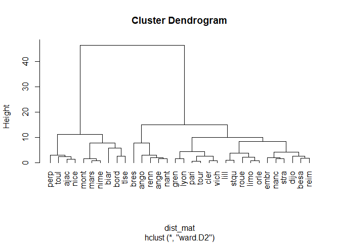
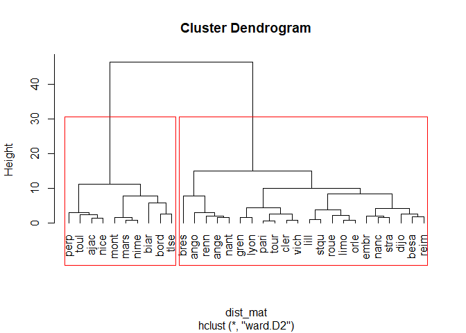
Here we can see that there are two main groups of cities that are classified using the HAC method : the northern cities and the southern cities of france. Which is logical since the temperature difference are important. Now let’s draw out the groups of cities on the dendrogram
1
2
3
4
5
plot(fit, hang=-1, label=cities)

# drawing out rectangles on the dendrogram with k=2 (two groups of cities which is the n-1 iteration of the classification)

rect.hclust(fit, k=2, border='red')
1
2
3
#storing the names of the cities in the group variable

groups=cutree(fit, k=2)
K-means method
Let’s use a different approach to classify the cities and find the best number of clusters using different statistical criterion.
We need to load the library cluster and make a kmeans model
1
2
3
4
5
6
7
8
9
library(cluster)

# declaring the kmeans model with our numeric columns and k=2 (k is an empirical choice of parameter, we're using 2 based on our previous test with the HAC method)

km= kmeans(data[,-1], 2)

# plotting the clusters

clusplot(data[,-1], km$cluster, shade=T, color=T, labels=2, lines=8)
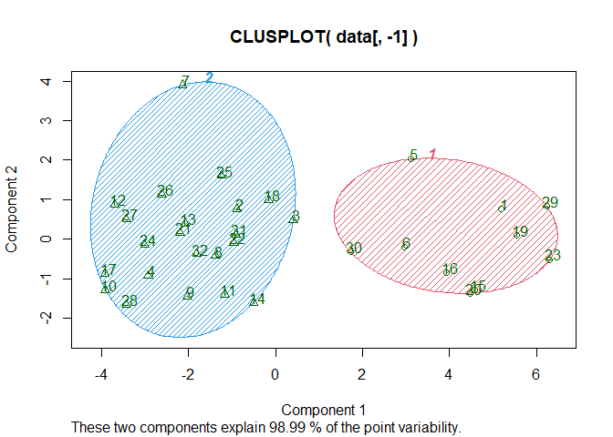
We can see that the kmeans method with 2 clusters allows us to explain 98.99% of the data which is a very good result. We can assume that the cities in the red cluster are the southern cities, given their number.
Another way of representing the clusters is by displaying the cities according to their temperature over 2 months.
1
2
3
4
5
6
7
8
9
10
11
# declaring another kmeans model

km = kmeans(data[,-1], 2)

# plotting the data of the month of july over the month of mars (average temperature over 10 years)

plot(data[,4], data[,8], type="n", xlab=dimnames(data)[[2]][4], ylab=dimnames(data)[[2]][8])

# setting the labels as the name of the classe the cities belong to (1 or 2)

text(data[,4], data[,8], km$cluster)
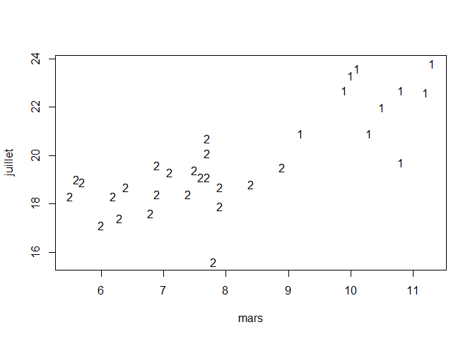
And now we can display the names of the cities belonging to class 1 or class 2 :
1
cat("Classe 1 : ", as.character(data[km$cluster == 2,1]), fill=T)
1
2
## Classe 1 :  ange  ango  besa  bres  cler  dijo  embr  gren  lill  limo  lyon
## nanc  nant  orle  pari  reim  renn  roue  stqu  stra  tour  vich
1
cat("Classe 2 : ", as.character(data[km$cluster == 1,1]), fill=T)
1
## Classe 2 :  ajac  biar  bord  mars  mont  nice  nime  perp  toul  tlse
As assumed previously, the cluster with the least cities is the one the regroups the southern cities, on the opposite, the one with th most cities is the one that regroups the northern cities.
Finding the appropriate number of clusters to specifiy with criterion
We’ve tried to put a empirical number of clusters but it’s important to use statistical criterion to find out the best number of clusters (BIC, total inertia etc.) Let’s use the library NbClust that will run multiple tests and return the best number of clusters :
1
2
library(NbClust)
NbClust(data[,-1], index="all",dist_mat, distance=NULL, min.nc=2, max.nc=10,method="ward.D2")
1
2
3
4
5
6
7
8
9
10
11
12
13
14
15
16
17
## *******************************************************************
## * Among all indices:
## * 9 proposed 2 as the best number of clusters
## * 4 proposed 3 as the best number of clusters
## * 4 proposed 4 as the best number of clusters
## * 1 proposed 5 as the best number of clusters
## * 1 proposed 6 as the best number of clusters
## * 2 proposed 8 as the best number of clusters
## * 2 proposed 9 as the best number of clusters
## * 1 proposed 10 as the best number of clusters
##
##                    ***** Conclusion *****
##
## * According to the majority rule, the best number of clusters is  2
##
##
## *******************************************************************
So according to the majority rule, the best number of clusters is 2. Which is convenient because we used k=2 as examples.
Fromage (Cheese)
This dataset has measure on nutritive caracteristics of each 29 cheeses. The ojectiv is to identify homegeneous cheeses that share similar caracteristics. The principle is quite the same as for the previous dataset.
Setting up our data
1
2
3
4
5
6
7
# Loading our dataset

data_cheese = read.table('D:/2021-2022-UBS/Statistique/Data mining/fromage.txt', sep="\t", header=T)

# Displaying the head

head(data_cheese)
1
2
3
4
5
6
7
8
9
10
11
12
13
14
##      Fromages calories sodium calcium lipides retinol folates proteines
## 1 CarredelEst      314  353.5    72.6    26.3    51.6    30.3      21.0
## 2     Babybel      314  238.0   209.8    25.1    63.7     6.4      22.6
## 3    Beaufort      401  112.0   259.4    33.3    54.9     1.2      26.6
## 4        Bleu      342  336.0   211.1    28.9    37.1    27.5      20.2
## 5   Camembert      264  314.0   215.9    19.5   103.0    36.4      23.4
## 6      Cantal      367  256.0   264.0    28.8    48.8     5.7      23.0
##   cholesterol magnesium
## 1          70        20
## 2          70        27
## 3         120        41
## 4          90        27
## 5          60        20
## 6          90        30
1
2
3
# Summary

summary(data_cheese)
1
2
3
4
5
6
7
8
9
10
11
12
13
14
15
16
17
18
19
20
21
##    Fromages            calories       sodium         calcium
##  Length:29          Min.   : 70   Min.   : 22.0   Min.   : 72.6
##  Class :character   1st Qu.:292   1st Qu.:140.0   1st Qu.:132.9
##  Mode  :character   Median :321   Median :223.0   Median :202.3
##                     Mean   :300   Mean   :210.1   Mean   :185.7
##                     3rd Qu.:355   3rd Qu.:276.0   3rd Qu.:220.5
##                     Max.   :406   Max.   :432.0   Max.   :334.6
##     lipides         retinol          folates        proteines
##  Min.   : 3.40   Min.   : 37.10   Min.   : 1.20   Min.   : 4.10
##  1st Qu.:23.40   1st Qu.: 51.60   1st Qu.: 4.90   1st Qu.:17.80
##  Median :26.30   Median : 62.30   Median : 6.40   Median :21.00
##  Mean   :24.16   Mean   : 67.56   Mean   :13.01   Mean   :20.17
##  3rd Qu.:29.10   3rd Qu.: 76.40   3rd Qu.:21.10   3rd Qu.:23.40
##  Max.   :33.30   Max.   :150.50   Max.   :36.40   Max.   :35.70
##   cholesterol       magnesium
##  Min.   : 10.00   Min.   :10.00
##  1st Qu.: 70.00   1st Qu.:20.00
##  Median : 80.00   Median :26.00
##  Mean   : 74.59   Mean   :26.97
##  3rd Qu.: 90.00   3rd Qu.:30.00
##  Max.   :120.00   Max.   :51.00
Let’s draw boxplots :
1
boxplot(data_cheese[, -1])
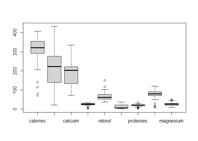
Looking at the boxplots, we see that there are a lot of outliers and the values of each variables differ in terms of ranges that will create noise in our clustering models. A solution to this is to scale (center and reduce) the data in order to have values between 0 and 1 for all our numeric variables.
1
2
3
data_cr = scale(data_cheese[, -1])

boxplot(data_cr)
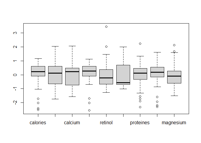
Here our variables have a much more balanced distribution so it will be easier to compare them.
HAC method
Now that our data has been preprocessed, we can go on with the HAC method. Let’s define our distance matrix :
1
2
3
4
5
6
7
8
9
10
11
12
13
14
# creating the distance matrix

dist_mat = dist(data_cr)

# creating the labels for the cheese

cheese = as.character(data_cheese[, 1])

# fiting the HAC model using wards method

fit2 = hclust(dist_mat, method="ward.D2")

plot(fit2, hang = -1, label=cheese)
rect.hclust(fit2, k=4, border='red')
1
groups=cutree(fit2, k=4)
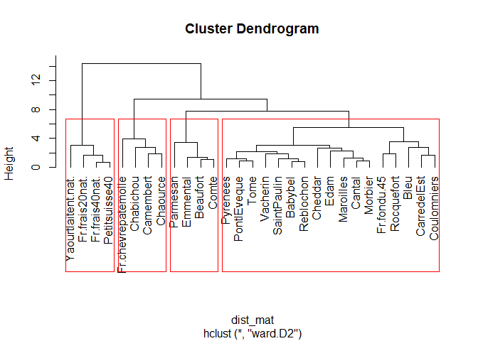
There’s 4 classes here, we used k = 4 in the rect.hclust() function. We can see the classes that are :
- fresh cheese (fromage frais / kinda liquid-ish cheese) - stinky cheese (the ones that old for too much time in a cellar)
- hard cheese (the ones you put in home made sandwiches)
- the other cheeses (probably the origin of the milk and they don’t grow old in a cellar)
K-means method
Let’s use a different approach to classify the cheese and find the best number of clusters using different statistical criterion. We need to load the library cluster and make a kmeans model
1
2
3
4
5
6
7
8
9
library(cluster)

# declaring the model

km= kmeans(data_cr[,-1], 4)

# plotting the clusters

clusplot(data_cr[,-1], km$cluster, shade=T, color=T, labels=2, lines=8)
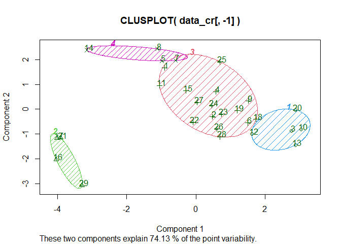
There are 4 clusters, they allow to explain only 74.13% of the data which is not a very good score. We could go for the try and error method to see how much cluster would give us the best explanantion ratio but we’ll use NbClust to figure it out :
1
2
library(NbClust)
NbClust(data_cr[,-1], index="all",dist_mat, distance=NULL, min.nc=2, max.nc=10,method="ward.D2")
1
2
3
4
5
6
7
8
9
10
11
12
13
14
15
## *******************************************************************
## * Among all indices:
## * 6 proposed 2 as the best number of clusters
## * 7 proposed 3 as the best number of clusters
## * 2 proposed 4 as the best number of clusters
## * 5 proposed 5 as the best number of clusters
## * 3 proposed 9 as the best number of clusters
## * 1 proposed 10 as the best number of clusters
##
##                    ***** Conclusion *****
##
## * According to the majority rule, the best number of clusters is  3
##
##
## *******************************************************************
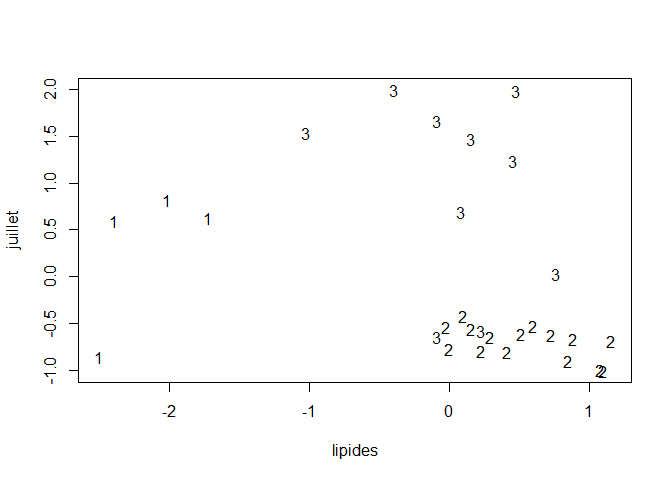
On the output we see that the best number of clusters is going to be 3. Let’s try it out :
1
2
3
km = kmeans(data_cr[,-1], 3)
plot(data_cr[,1], data_cr[,6], type="n", xlab=dimnames(data_cr)[[2]][4], ylab=dimnames(data)[[2]][8])
text(data_cr[,1], data_cr[,6], km$cluster)
1
cat("Classe 1 : ", as.character(data[km$cluster == 3,1]), fill=T)
1
## Classe 1 :  ajac  besa  biar  bres  cler  gren  lyon  mars  renn  stqu  tlse
1
cat("Classe 2 : ", as.character(data[km$cluster == 2,1]), fill=T)
1
2
## Classe 2 :  ange  ango  bord  dijo  embr  lill  limo  nant  nice  nime  pari
## perp  reim  roue  stra  tour  vich
1
cat("Classe 3 : ", as.character(data[km$cluster == 1,1]), fill=T)
1
## Classe 3 :  mont  nanc  orle  toul
We have 3 obvious classes that are characterized by the amount of proteins and lipids in ther cheese. We can assume that the more lipids there are, the less protein there is in the cheese.
Conslusion
This sums up a quick hands on clustering using R. I’ll be updating this post soon to provide more insight on various techniques and manual calculations of some criterion.
